UX/UI Design | 2024
Secured Crypto-Platform
with BitPoseidon
ROLE
Lead UX/UI Designer
TOOLS USED
Figma, Photoshop, Illustrator
YEAR
2024
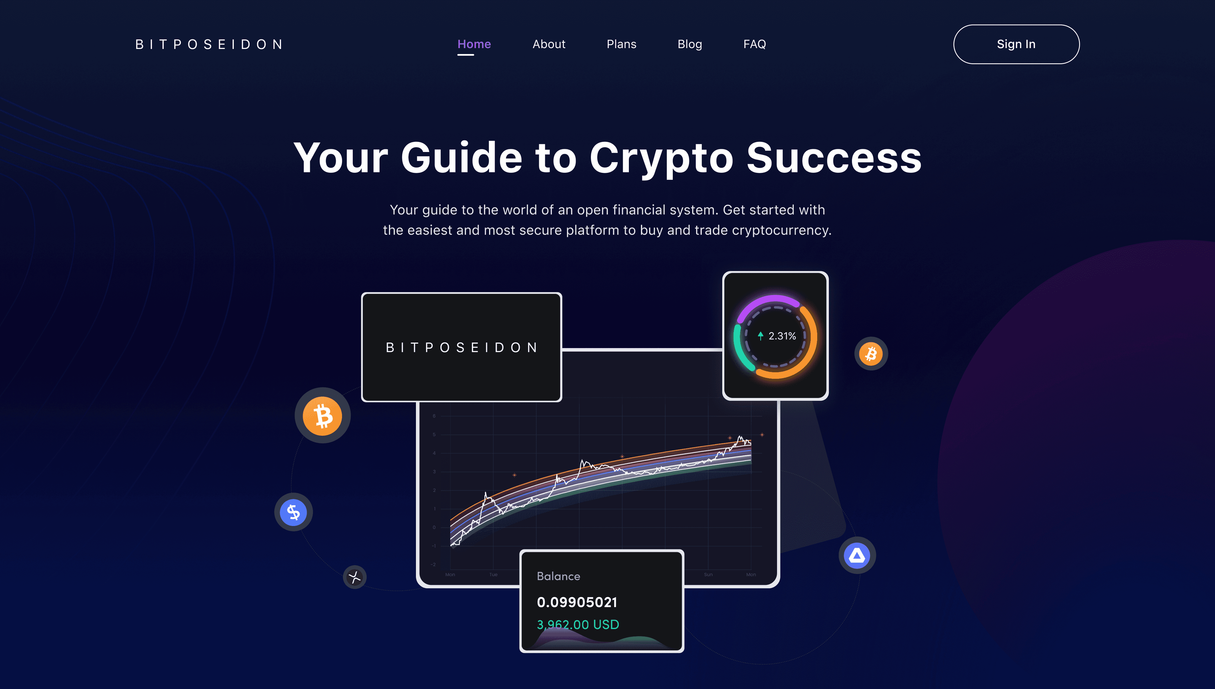
BitPoseidon is a platform which is the guide to an open world financial system where you can buy and trade cryptocurrency. The goal is to create a secure platform where you can seamlessly buy digital currencies and keep track of them in one platform
Timeline
From user research to the final designs in 16 weeks while working with multiple projects at the same time
This category describes the challenges that I faced since the initiation of the idea to the final prototype of the project
Designing responsive dashboard
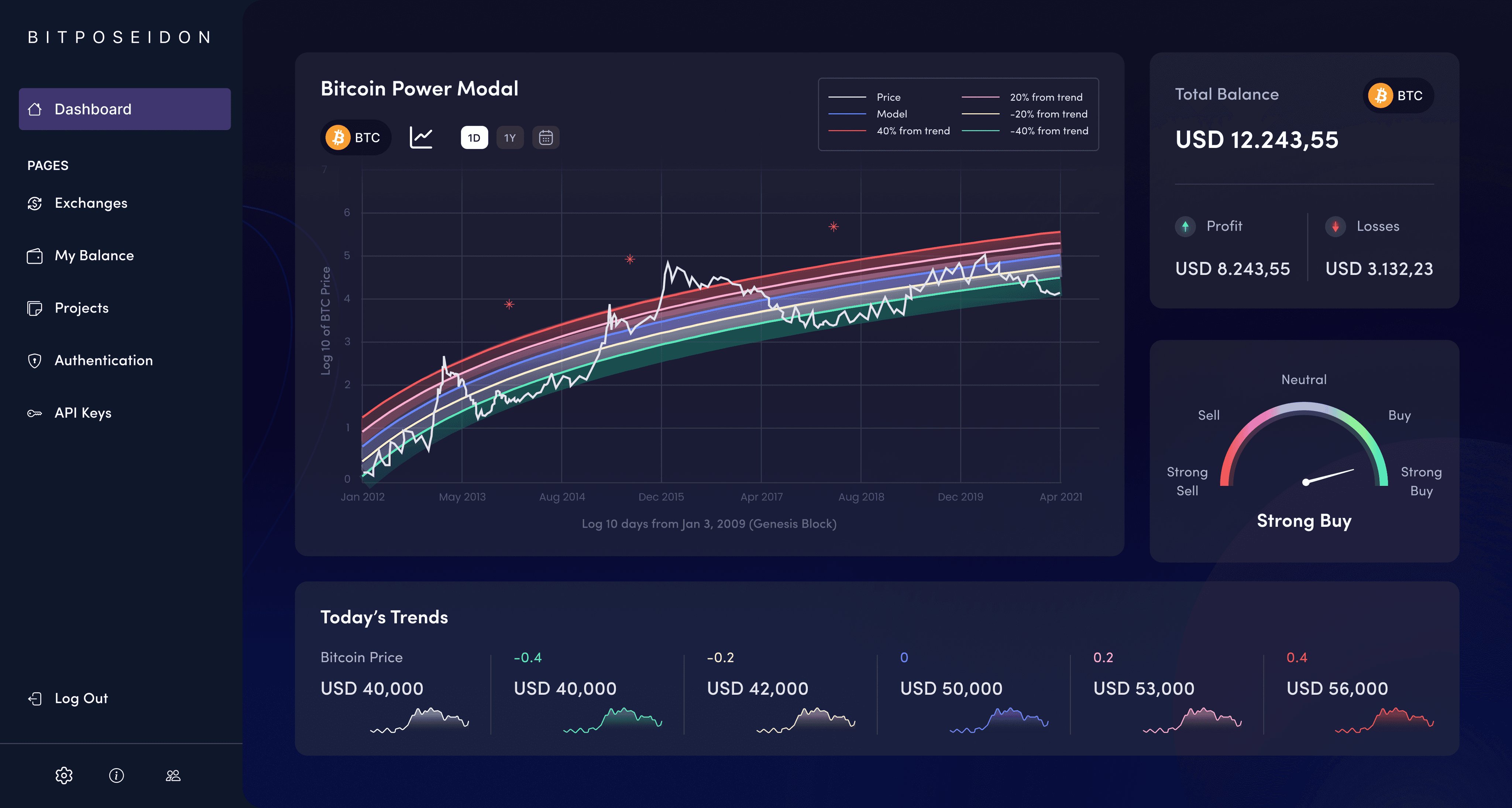
Create an intuitive Bitcoin Power Modal dashboard that was responsive across all the platforms where user can view the current price, model, and fluctuations in the trend over the period.
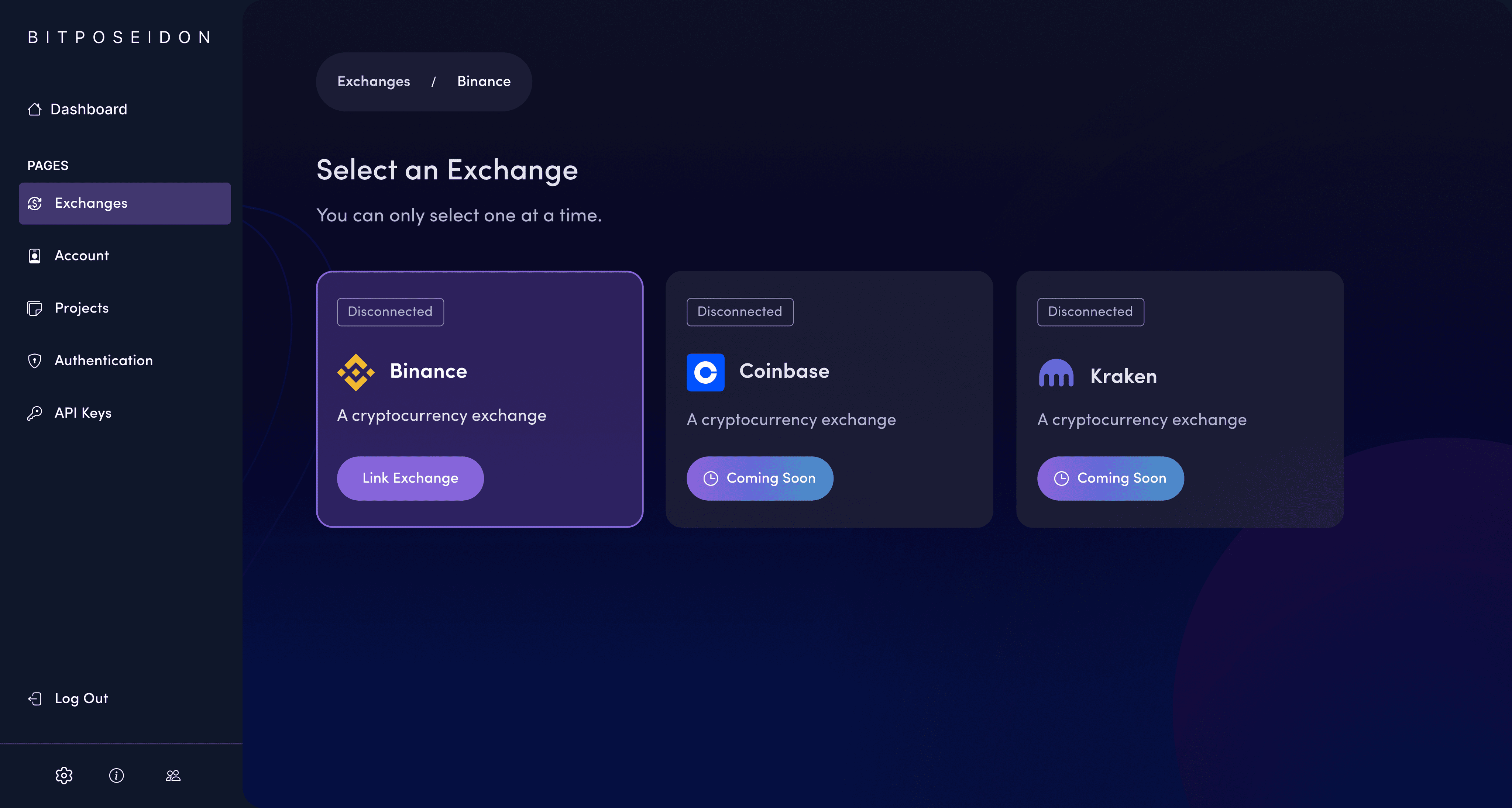
Creating easy to follow process to select desired exchange
Easy to grasp the concept of selecting and linking the exchange easily through the website by the users was required to be designed.
Designing responsive buy/sell indicator dial
The dashboard required a responsive dial to show when it is a good time to either buy or sell the exchange.
Creating seamless transaction history with Timestamp Display
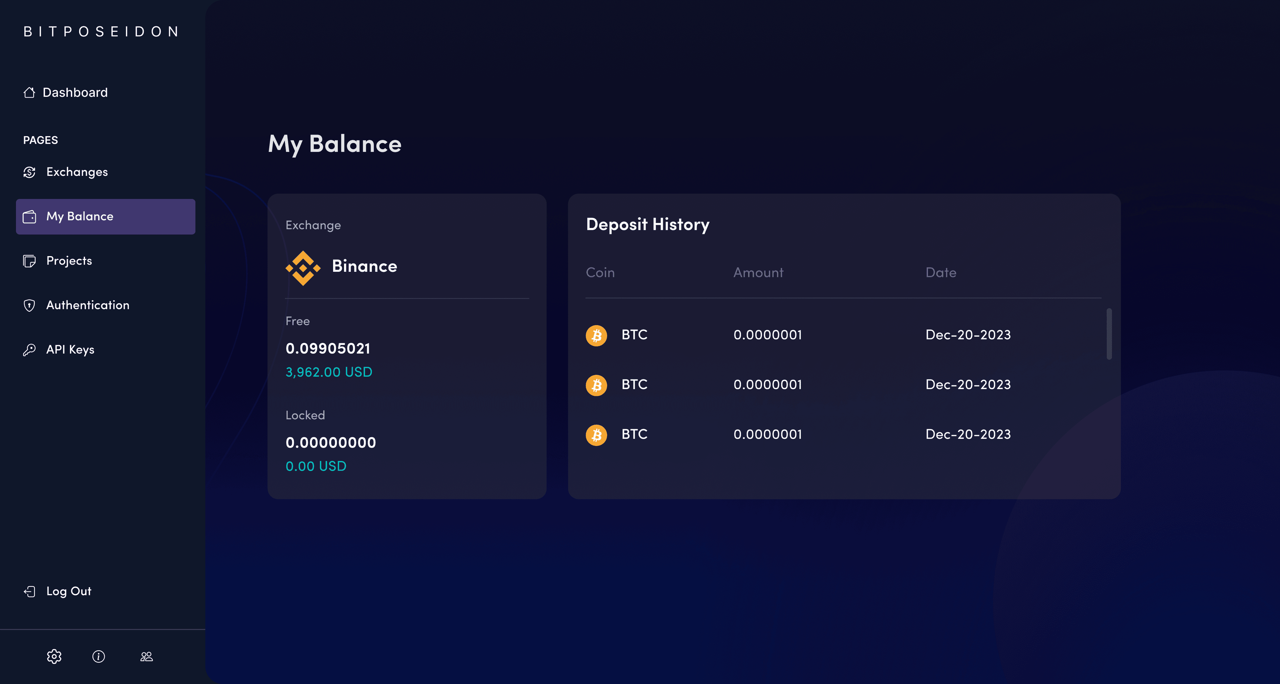
Designing a balance page where users can view the free and locked balance of their exchange with timestamp history
Dark UI Interface Design Challenges
Regarding the design, it was a great challenge to design and create components that are properly seen in the dark UI interface.
This category details the design thinking process that I have implemented on the project which is an iterative, non-linear process that provides solution-based approach to solving problems. It brings innovative solutions based on how users think, feel and behave.
Empathize
The goal was to understand the end-user needs, which is for the crypto traders to have an easy, fast way to access the balance of exchanges, trends, and decision-making tools in no time. Therefore, I then conducted user interviews and surveys with cryptocurrency traders to discover pain points. I discovered:
Users wanted a graphical representation of bitcoin price trends in the dashboard to view the deviation from the trend.
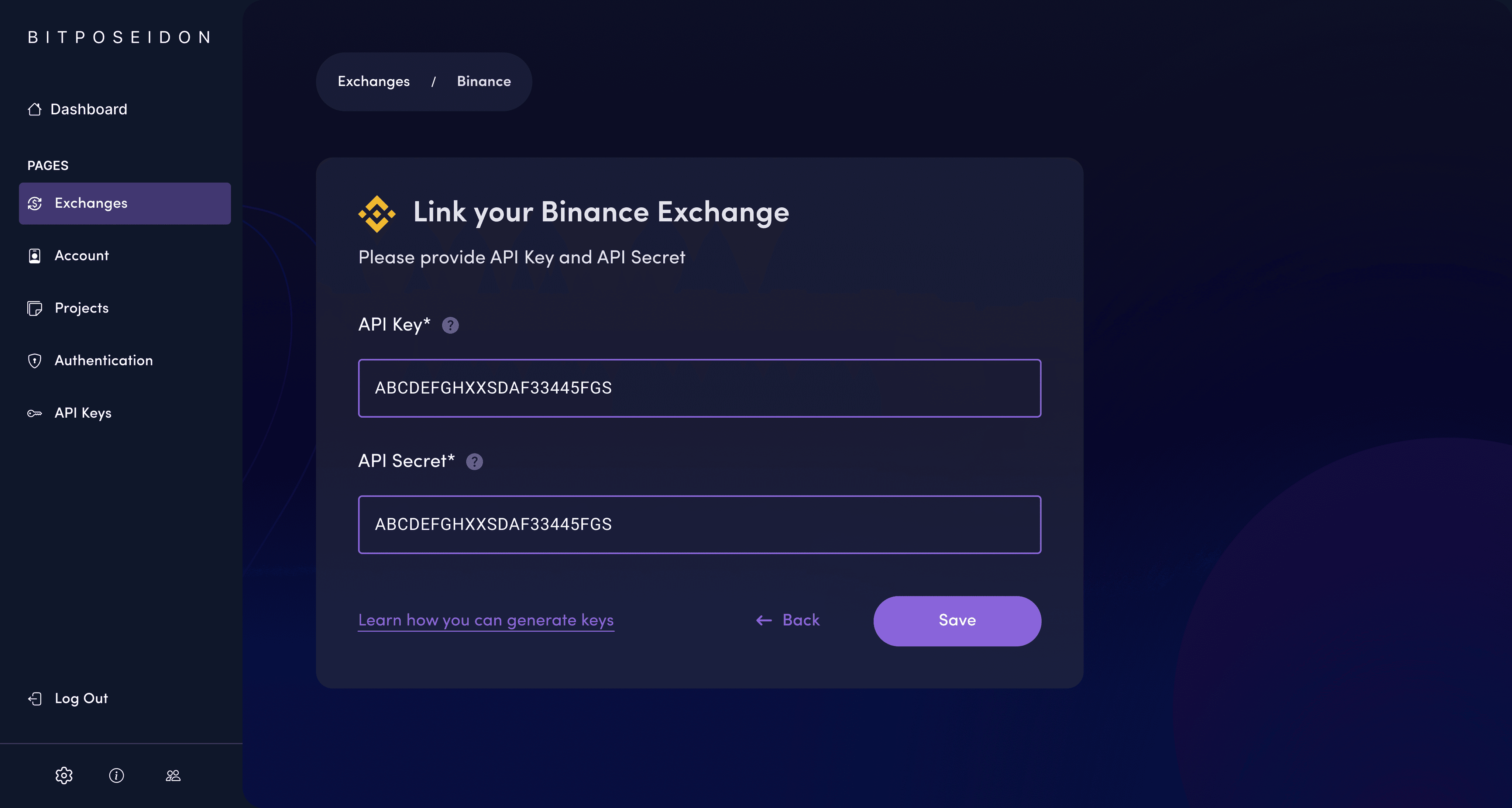
Users wanted an simplified process of linking exchanges and inputting API credentials.
Users wanted an clear suggestion on profits, losses, and buy/sell recommendations through the website.
Define
It was crucial for me to pitch the problem statement from the perception of the user's needs rather than perception of my own. The problem statement here was the users have to intuitively connect multiple exchanges, observe price trends of cryptocurrencies, and make informed decisions based on profit and loss. I needed to address "how might i create an intuitive design to ease the connecting of the exchanges and input of API credentials?" "How might I provide a clear interface to distinct profits, loss, buy/sell suggestions". I then established a persona, created user journeys for the persona to come up with features, functions and other elements to answer the "How might I" questions.
Ideate
I then brainstormed ideas to address the pain points. I considered several design alternatives-lighter accent color, intuitive charts on price trends, clear input fields with helper text for API integration for dashboard and balance pages. Before creating wireframes and prototypes, I created user journeys and sitemaps to further visualize the ideas. I sketched and created wireframes showing card-based selections for exchanges, clear API input form for the balance page. I then designed a responsive buy/sell indicator for dashboard.
Design
The aim here was for me to identify the best possible solution for each of the problems identified to the during the first three stages. Firstly, I created a design system in accordance with the user theme selected and started creating intuitive user interfaces and iteratively refined designs based on user feedback to enhance usability, maintain visual consistency and adhere the design with AODA standards.
I then implemented the solutions within the interactive prototypes and conducted testing on each of the prototypes within the selected testers. I developed beautiful and interactive dark-mode prototypes. The layout was visually set out with clear sections for balance, profit/loss, and trends in the dashboard. The components were designed for engagement and comprehension, such as a the color of dial component and graphs that support interaction in the dashboard.
I followed iterative process to refine prototypes through accounting for user feedback to enhance contrast, rework the form design into an API-optimized input design, and allow more interactivity for trend visualizations on the dashboard.
Test
Finally, I conducted usability testing with a group of traders to ensure navigation is easy to use, balance/profit/loss are understood, and the buying/selling via dial is intuitive. Also, I tested clarity in the process of inputting information via API.
Users loved the simplicity of the interface, including the easy-to-read dark theme, very clear profit/loss breakdown, and intuitive linking of exchanges.
Following the design process, these were the important features that I implemented into my final designs to address the user's pain points and understand their needs.
Graphical Representation of Bitcoin Price Trends in the dashboard
Color bands reflecting deviation from the trend visually divide the graph of history in the price of Bitcoin, thereby helping users understand how it has fluctuated over time. It helps the user get an even more insightful interaction with the use of labels and toggles.
Exchange Linking with Clear API Input Forms
An interface based on cards that easily switches between the exchanges through pop-ups, with each one clearly indicated as "linked" or "disconnected". This enables easy handling of multiple exchanges by the user through a clear overview that is accessible. Here, to link exchanges, an intuitive form is used with labeled fields like API Key and API Secret, having an information icon that will show more details on how to fill out these API credentials
Responsive Dial for Buy/Sell Decision Making
Designed a color-of-dial indicator, indicating favorable time for users to buy or sell. Gradients from red to green, for strong sell to strong buy, respectively, with a pointer for users to have a clear, responsive mechanism through which decisions can be made.
Balance Display with Profit/Loss Distinction in the dashboard
In the overview of the total balance on the dashboard, the current balance will be underlined, while profits and losses will be clearly represented in color so that the user can have a quick overview of the whole financial performance.
Dark UI Readability Enhancement
In order to solve the issue of visibility inside a dark UI, high-contrast text with bold accent colors was used together with clear visual hierarchies. The dashboard uses bright colors on top of a dark background for important information such as buttons, profit/loss, and graph outlines to make it more readable.
Here, the outcomes and achievements of the project are highlighted, including user feedback, adoption rates, and industry recognition.
Positive User Reception Upon Launch
After various usability testing, heuristic review, collaborating with the developers and finally with the launch all over the channels, BitPoseidon was met with enthusiastic response from the users.
Responsive Dashboard Earned High Praise
The responsive dashboard garnered positive responses where they said it was easy to view and click through fluctuations in the trends.
Increased User Satisfaction by 8%
At the end of three months, user registration to the website grew by 8%. Finally, they found the platform to be secured and easier to view trends of exchanges, balance summary of the exchange and conduct buying and selling of cryptocurrencies easily.
Growing User Base
The website quickly gained traction among individuals and businesses worldwide, with a steady increase in user adoption and engagement.
